facebook
Kitchen Hardware and Faucet Combinations

Kitchen Hardware and Faucet Combinations

Kitchen Hardware and Faucet Combinations

Arguably my favorite part of my job is making selections. And two of my favorite selections to make are kitchen faucets and cabinet hardware. I think they’re capable of changing the entire vibe of a space and I love to coordinate them in subtle ways. Below you’ll find my 4 favorite faucet and hardware combos as well as a little insight into how I’ve gone about pairing them together. 

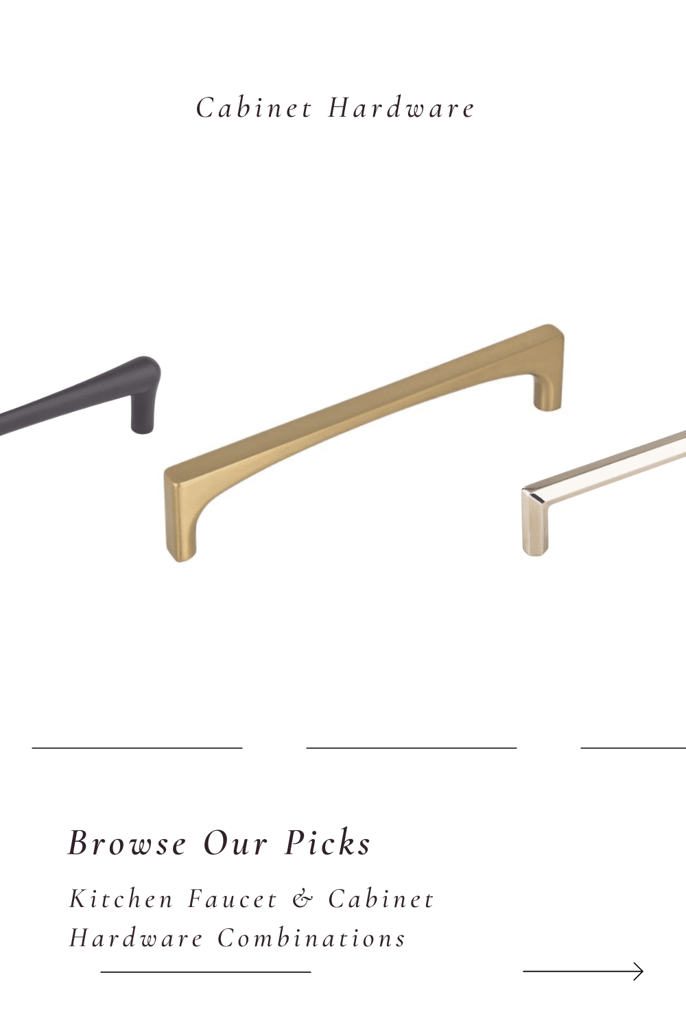
Hansgrohe Allegro+Top Knobs Riverside Pull in Honey Bronze

 I love the smooth curves of the Hansgrohe Allegro faucet. It’s a high end affordable fixture that truly shines on a countertop. The riverside pull from Top Knobs is one of my favorites because of how simple it is. Straight on the pull simply looks like a bar but from the sides and below it has the same smooth curvature as the faucet handle of the Allegro making the two an obvious pair for me. 

Hansgrohe Lacarno + Top Knobs Serene

The Hansgrohe Lacarno is an absolute jewel in the kitchen. This faucet is glamorous and modern yet it’s simple and clean enough for just about any taste. Its octogan shaped base is a subtle detail that dresses it up just enough for it to be more than your basic modern faucet. The Serene knob from Top Knobs is an obvious choice for the Lacarno. With its similar base and simple clean lines the Serene compliments it perfectly, it’s a detail some people may never notice but the complimentary designs are something that will be pleasing to the eye for years to come. 

Hansgrohe Joleena + Top Knobs Barrington

The Joleena by Hansgrohe is a popular faucet with our clients. Its a fantastic transitional faucet or for those interested in the ‘modern farmhouse’ vibe. It isn’t too fussy but still has some low key details that make it more eyecatching than your basic modern faucet. The tapered handle on the Joleena pairs wonderfully with Top Knobs Barrington pull. This pull is tapers down towards the middle and has a smooth continual shape. If finding something that isn’t fussy, is slightly transitional and feels amazing in your hands is what you’re after than this combo is definetely for you. 

Brizo Artesso + Top Knobs Kara Pull & Knob

Last but certainly not least we have the Brizo Artesso. Another faucet that has a way with commanding the kitchen. This faucet is large, it has an excelent sprayer and has beautiful details like the ridges around it and the ball on the end of the handle. I always suggest pairing this faucet with the Top Knobs Kara Pull & Knob. I love how both the Artesso and Kara have a ball on the end and the ridges around them. We put them in our kitchen and it’s a detail that not many people notice but there’s just something about the way they work together in the space that looks classic and beautiful. 

So when you’re working on your kitchen design some things to note when pairing your faucet and hardware that go beyond simply matching finishes, because surprise the finishes don’t have to match on the two! (But we’ll talk about that another day.)

Remember these tips:

  1. Similar base shapes, are the base of the cabinet hardware and the base of the faucet similar. Note how the base of the Lacarno and the base of the Serene are the same shape. 
  2. If the bases aren’t similar what other features are? If you cut a Barrington pull in half the taper of the pull would look almost identical to the tapered handle of the Joleena Faucet. 
  3. Details, details, details. The Artesso and the Kara knob and pull have th same details. From the ball on the end of each knob to the ridges around it. 

About The Author 

Lauren Murphy is Murphy’s Designs Selection Specialist and has been working for the company since 2010. She has a background in photography, and a certificate in Home Staging and Redesign. She loves to spend time researching new products and materials and staying up to date on all the Kitchen and Bath design trends. 

2023 Color Of the Year, Viva Magenta

2023 Color Of the Year, Viva Magenta

2023 Color Of the Year, Viva Magenta

Well here we are in 2023 and as sure as a new year always comes around so do the new colors of the year. Since we work in the design industry we follow it rather closely because as much as I sometimes dislike the colors chosen they seem to always insert themselves into my life and I like to be prepared! 

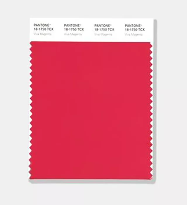
The most prominent of all the colors is usually Pantones selection. It finds its way into graphic, interior, and fashion design without fail every year. This year I have to admit I am not a fan of their chosen color, viva magenta.

It’s bright, its obnoxious and it wouldn’t find its way onto any of my clothes, websites, or to be honest, my house. However as much as I dislike it it usually does have some kind of influence and if you find yourself growing fond of the vibrant hue this year I’ve come up with a few ways to subtly incorporate it into your home without making any real permanent changes. As far as fashion goes though, you’re on your own!

Practical Ways Of Using Viva Magenta

Vintage china, designing with nostalgia in mind is at the forefront this year, from “Old Money Design” to “Hipstoric” and decorating with vintage china collections is a great way to incorporate all three design trends. There are tons of gorgeous hues of magenta in vintage transferware patterns available on etsy and most are even available in pre curated collections!

Vintage Mismatched Pink Red White Transferware

English Abbey Red Transferware Plate

Mismatched Pink Transferware Saucers Set 

Antique Royal Doulton Plate Set

Throw pillows are always a great way to add in a color you might be feeling a pull to, they’re easily purchased and easily stored when the seasons change or you’re ready for a new hue. 

Accents and decor, these magenta candles and this nesting tray can add a beautiful pop of color into any space during the cold months of January and February and they’ll carry you through spring and well into summer. You don’t have to look far for another way to incorporate the color, simply search your book collection for it! Gathering all of your pink and magenta toned books together is an excellent and free way to welcome the color of the year.

18″ Classic Taper Candles, Set of 4

Wall art, whether you’re going full magenta or picking something that has just a splash or hint, wall art is a fantastic way to incorporate bright colors without being overpowering.

Area rugs are another way to incorporate the color of the year into your, whether you decide to go with an all over saturation or just a hint or accent there are tons of fun options to liven up any space.

Like throw pillows throws themselves are an excellent way to add the color of the year to your space.

Woven Wool Dorsey Throw Blanket

The Tartan Blanket Co. Buchanan Throw Blanket


For those of you feeling in the mood to commit to viva magenta or for those that have always had a passion for the dark rich pink check out this gorgeous tile from Cle` tile. Outer Sunset from the watermark collection features a faded pink hue, “inspired by the rows of houses that border San Francisco’s ocean beach.”

Outer Sunset 4×8 tile by Cle` tile

About The Author 

Lauren Murphy is Murphy’s Designs Selection Specialist and has been working for the company since 2010. She has a background in photography, and a certificate in Home Staging and Redesign. She loves to spend time researching new products and materials and staying up to date on all the Kitchen and Bath design trends. 

Ashburn Virginia Bathroom Remodel on a budget Part III.

Ashburn Virginia Bathroom Remodel on a budget Part III.

Ashburn Virginia Bathroom Remodel on a budget Part III.

 It’s time to share the final photos of our Ashburn “Emergency” Bathroom Remodel on a Budget. We weren’t prepared for this remodel, hence the emergency part and we had to tap into our savings in order to do it. If you read my post about Mold and Mushrooms then you have the background.  Basically, six months into our new home our hall bath revealed a silent problem.  (If you haven’t read the entire post you can access it here:).

Now for the logistics; we were blessed to have enough savings but this was going to be a very tight budget for a full gut remodel. many new homeowners go into the first year cash poor and this project is a great example of a very tight budget for a full gut remodel. My decision to gut the bathroom was made easier as I know from my training that the only real fix is to have waterproofing installed.  Plus, I’m a health and wellness specialist and getting it done, the right way, once was important to us.

First step; top of the line Schluter Systems Kerdi waterproofing. This is something we do for all of our bathrooms at Murphy’s Design. The mold problem was caused from the builder not water proofing, then previous owners not maintaining the grout and caulk.  After experiencing the mushroom sprout it was even more obvious the importance of taking this step.  Proper waterproofing adds to the cost of materials and to the labor but it protects your investment forever.  Tip: Dont forego the Waterproofing….ever.

Because of the added expense in fixing the mold and doing the waterproofing we needed selections that were affordable, very affordable.  We purchased all of tile off the shelf from our local Floor & Decor and our vanity came off the shelf from Ikea. Our Tub, toilet, and other plumbing fixtures came from build.com. For the paint in this bathroom it’s Benjamin Moore’s AURA Bath and Spa Primer and Paint.  This is a special formula specifically developed to handle moisture.  We probably could have gotten away with using regular primer and the Aura paint but we wanted to be extra cautious. 

Something I Love,

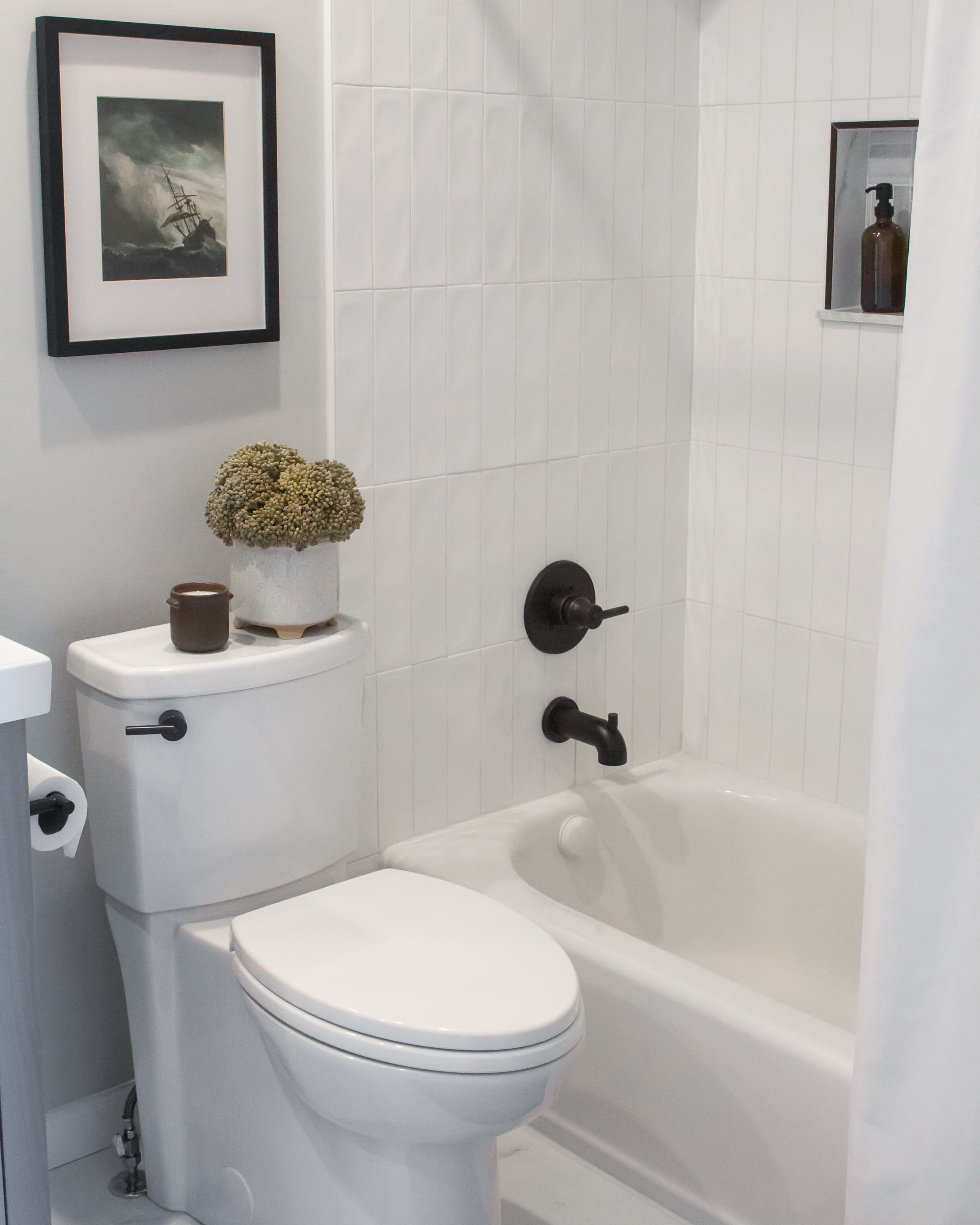
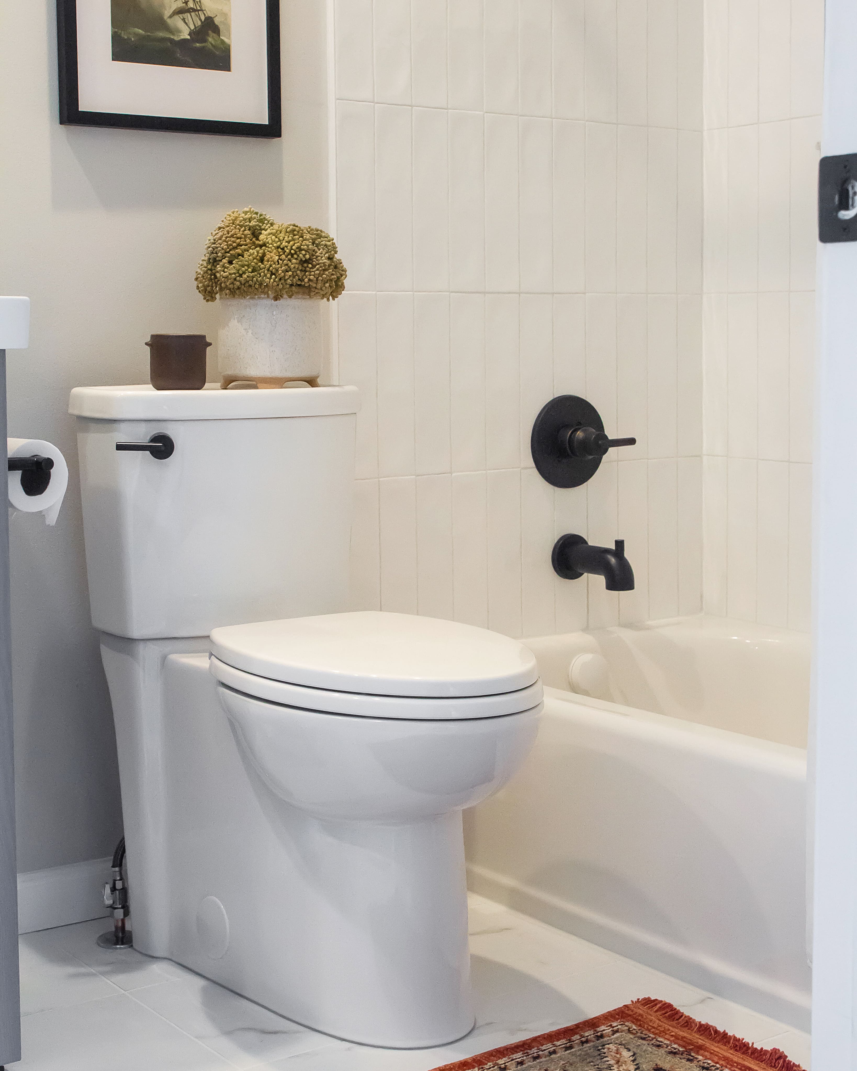
One thing I love about this finished space is the shower tile. I am obsessed with organic nature of it and at the same time the modern geometric straight stack pattern we had it laid in. The naturaI imperfect edges mixed with the high gloss white and straight stack just gives it a nice transitional feel, blending both my natural organic preference and my partners clean modern aesthetic perfectly.  

Really, photos just don’t do this space justice, the vertical straight stack pattern that this tile is laid in makes the room feel so tall and bright!  When you’re in the shower it has an open and airy feel to it that I’m just so happy with. 

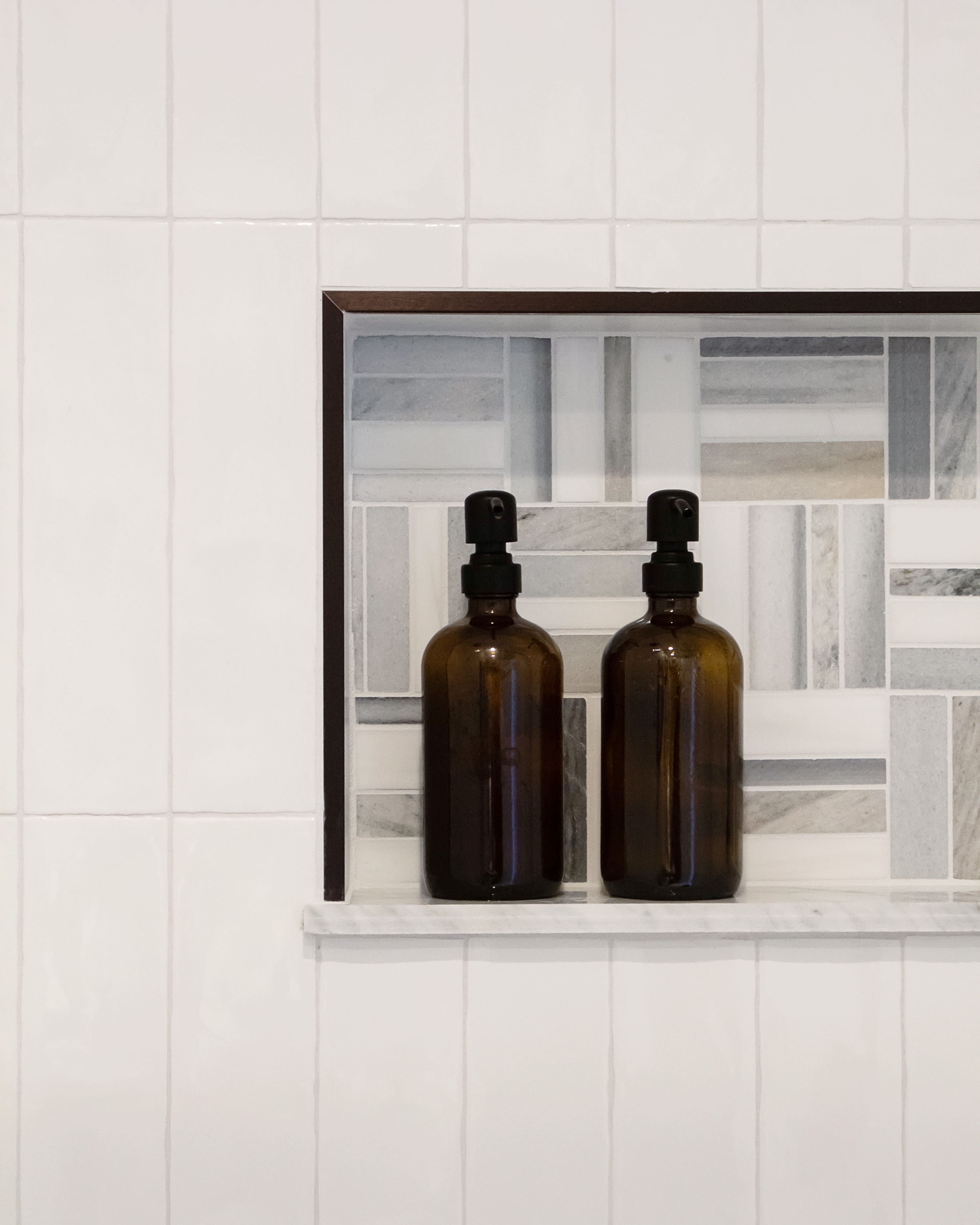
Something else I’m really happy with is the use of a marble threshold as the base of the niche. When we use these marble pieces it makes for a nice clean surface without any grout lines when your product drips. And let’s not overlook the bronze Schluter edging.  I love how it frames the niche and matches the fixtures. This is a fun way to incorporate some classy marble and a natural material while also creating a surface that is much easier to keep clean. I love how this niche takes an otherwise simple white shower and gives it a little art. 

Something I’d Change,

I have to be honest and say that because we had such a tight budget for this space I didn’t do as much research on the actual bathtub as I should have. If I could go back and select a soaker tub, I would. Even though it would’ve tapped into our savings a little more, in the end, it would have been worth it. This tub will work great for small children, and it also works great as a tub for adults who don’t take  a bath and primarily will use the shower. It’s easy to step over and it’s easy to bend over. What it’s not is a tub for adults to soak in.  It will work fine for us and it won’t affect resale value but if I could go back I probably would’ve spent more money and gotten the bigger tub. on the positive side, by not getting the bigger tub however we saved money because we didn’t have to move the plumbing fixtures up and the less fancy tub obviously costs less. It’s definitely something I’ll think harder about from now on though. 

Something That Surprised Me, 

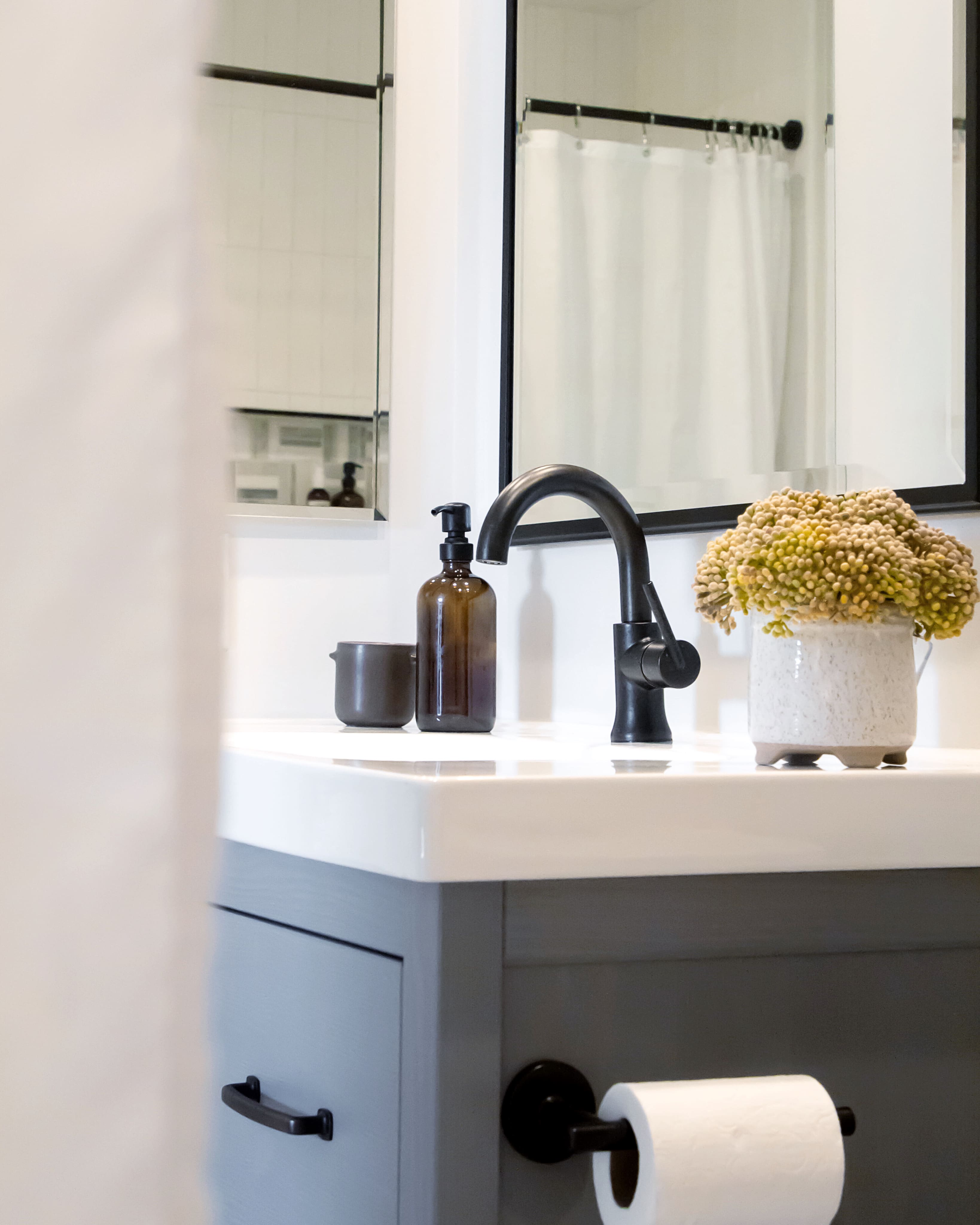
I can confidently say that I would buy another Ikea Hemnes Vanity. If you have the patience to wait for the vanity because of COVID it’s a great update.  I replaced the hardware for some more high end pulls instead of their knobs and it really pulled everything together. The vanity is solid, it comes with the top, nice size drawers and has tons of storage. I may even put the white version of this same vanity in our master bathroom just for consistency.   

We are thrilled with how this bathroom turned out, I learned a lot working for myself on making sure the pieces we choose works for the long haul. Hopefully, for our next space, we’ll have just a little more time to plan.

About the Author
Lauren Murphy has worked with Murphy’s Design since 2010, she has a background in photography and is a Certified Home Stager and Redesigner. She currently lives in Loudoun County Virginia with her partner, Jonathan and their dog Rory.  // 703-854-1343

Emergency Remodel Bathroom Selections Part II.

Emergency Remodel Bathroom Selections Part II.

Emergency Remodel Bathroom Selections Part II.

Well, here we are. I had big dreams of remodeling our home but I have to be honest I didn’t think that they were going to go like this. Making Emergency Remodel bathroom selections are very different than making selections when you’ve saved and prepared for a remodel. I had planned on saving a good deal of money, I had planned on having time to make my selections, I had planned on a very different experience. The truth of the matter is with remodels you don’t always get to have what you planned. Sometimes there are air ducts that cant be moved, electrical that can’t be moved, mushrooms magically appearing and forcing you into an impromptu renovation during a global pandemic. Things come up. It happens. Luckily, it’s part of my job to figure it out.

If you’re just joining me and haven’t seen my previous post  about the Terrace Turnaround Project and how I got here, I recommend giving it a quick read for a little back story. It will get you up to speed and paint a clearer picture of this situation.

So, it’s time for the Terrace Turnaround Bathroom Selections. I LOVE making selections. It’s what I’m good at, I can visualize spaces before they’re completed simply by pulling the right selections. Very few things in life give me as much of a rush as good selections.

First things First with this space, the mold. Honestly as much fun as making selections is solving that problem, getting rid of it and making sure it never returns was my top priority. So as I mentioned in my last post, we made sure the mold hadn’t spread outside of the bathroom and then cleaned the mold and sealed the sub floor and drywall with KILZ. Once all of that was done the guys added new drywall where it was needed and waterproofed the space with Schluter products. We use Schluter on every job. A good bathroom starts with great waterproofing, never let anyone cut this corner in your space. Without good waterproofing your new bathroom was basically a waste of time.

Now that I think I’ve sufficiently lectured you about properly waterproofing your bathroom I think we can move on to the fun stuff! 

Tile Selections

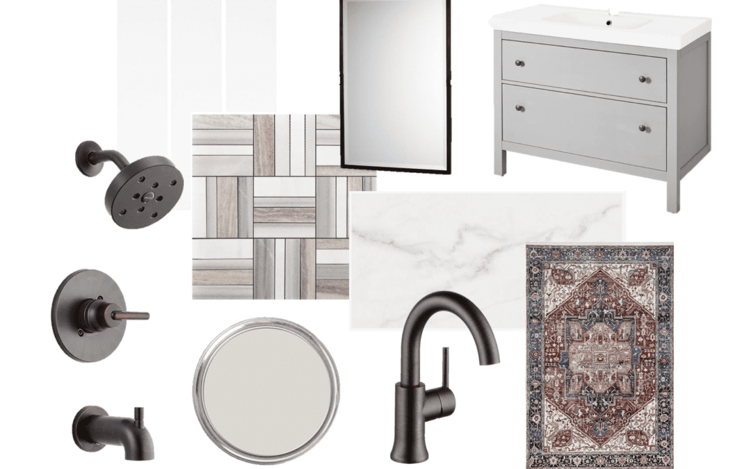
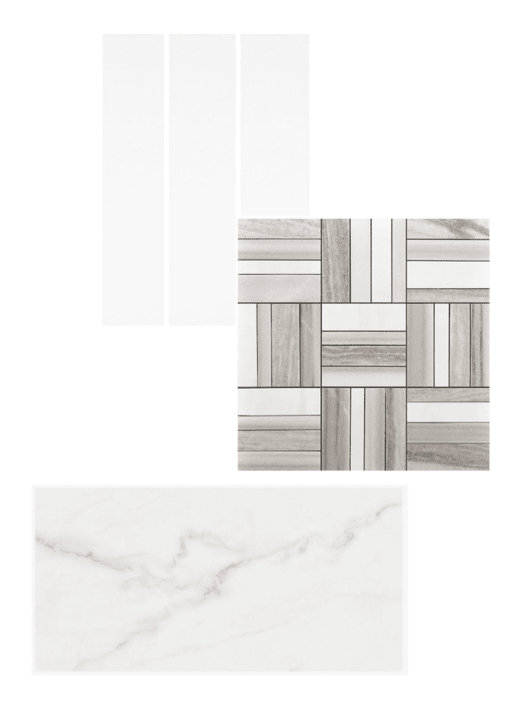
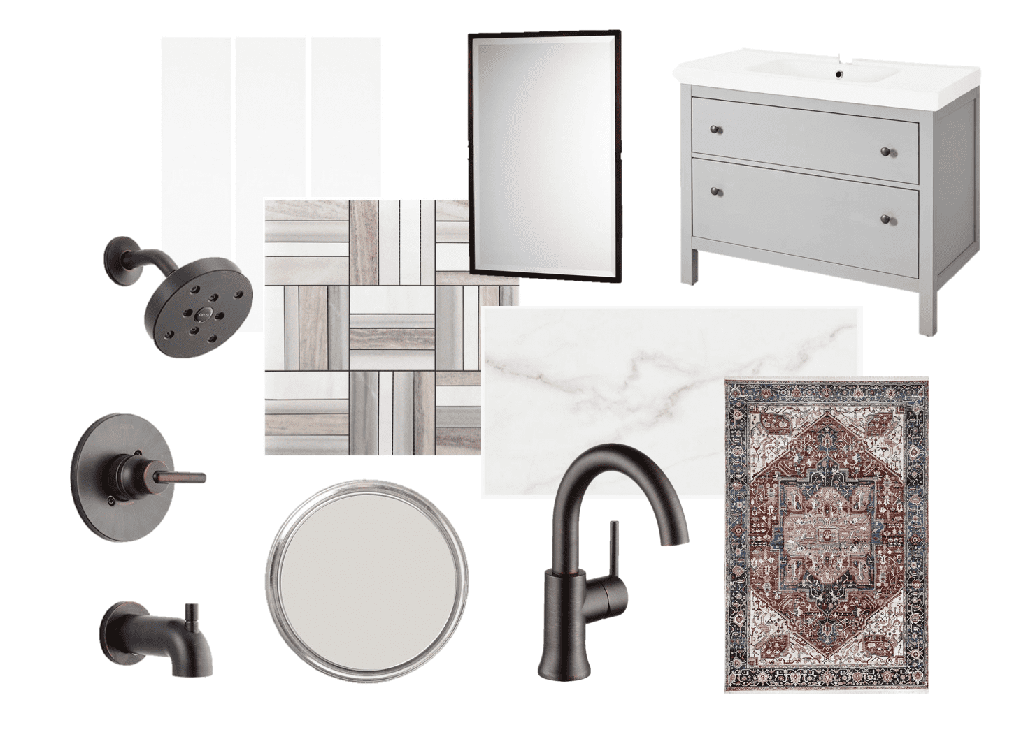
My significant other loves clean warm grays, so we went with a white ‘subway tile’ laid in a vertical straight stack pattern. I really wanted to add height to the space and this is a good way to do it. For the niche I chose a tile that coordinated nicely with the vertical pattern as well as the marble look of the porcelain floor tile. We topped the niche off with a piece of marble threshold for ease of cleaning and to dress it up a bit. 

Plumbing Selections

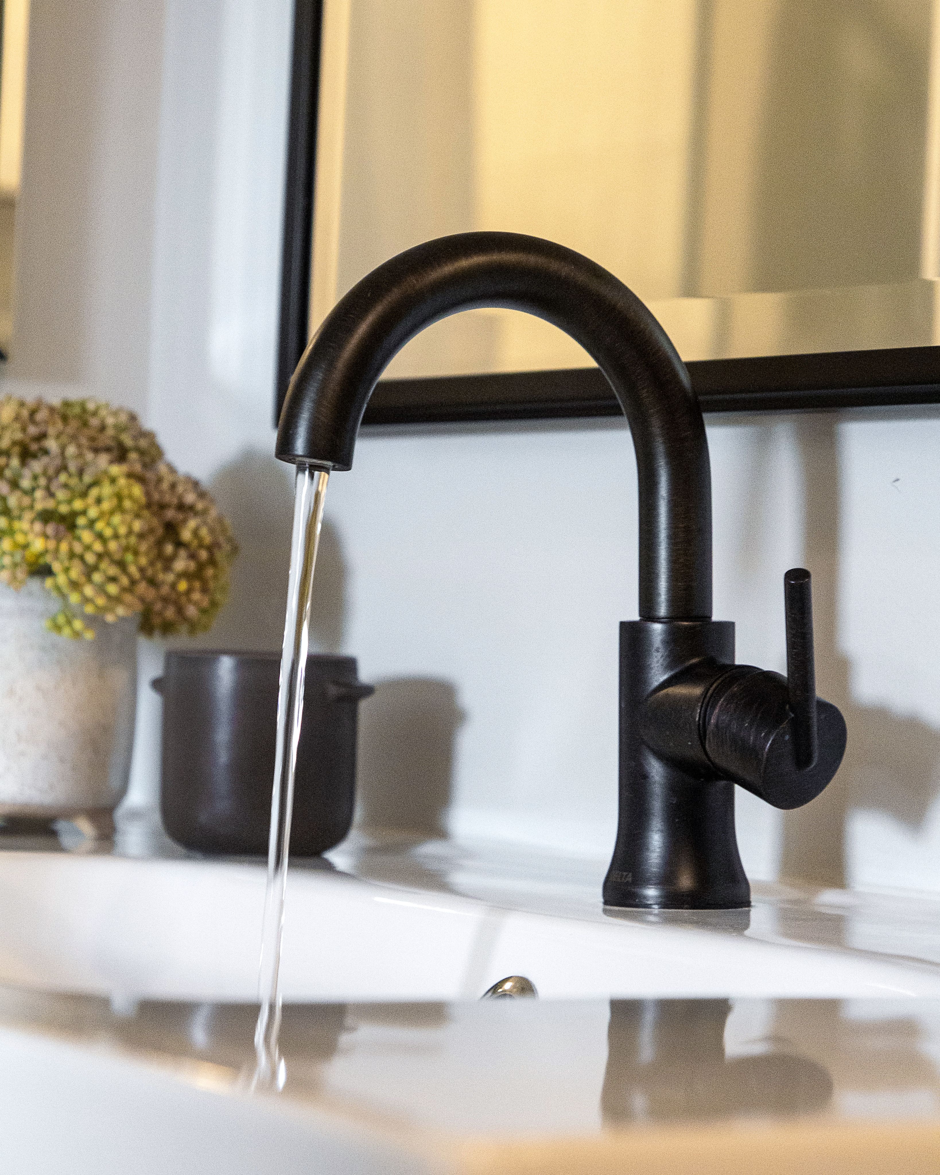
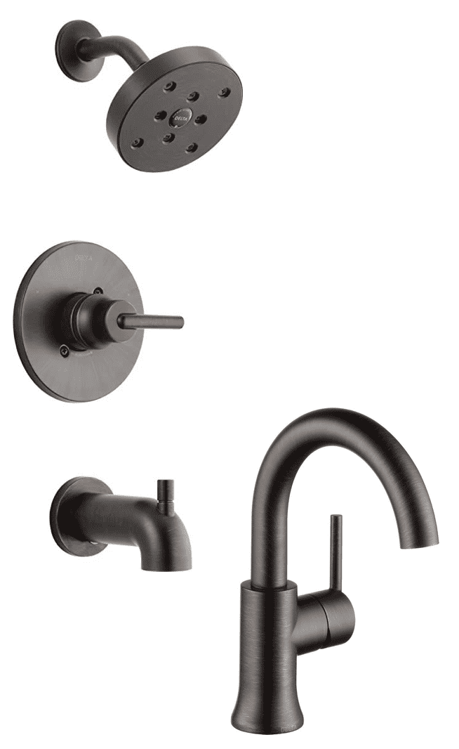
As far as plumbing fixtures I went straight for my go to Delta Trinsic Facuet and shower head and tub filler. They’re simple, affordable, and the style is transitional enough to work in most spaces. 

The Mood Board

As a whole this space needed to have products that were quick and easy to source as it was a last minute must do remodel and they needed to be affordable. As far as the design went I wanted to be slightly masculin since this is my significant others bathroom in his office but at the same time neutral so that when we sell the house in the future it doesnt turn anyone off by having too distinct of a style. With my background in Home Staging I am constantly thinking about resale, sometimes to a fault. But we know this isn’t our forever home so in this case it was important the space work for both my significant other and future children that may inhabit the room. 

My next post will share with you the after photos of the space and I am SO thrilled with how everything turned out. I’ll also talk a little about selecting a bath tub and some things I would’ve done differently in hindsight. 

About The Author 

Lauren Murphy is Murphy’s Designs Selection Specialist and has been working for the company since 2010. She has a background in photography, and a certificate in Home Staging and Redesign. She loves to spend time researching new products and materials and staying up to date on all the Kitchen and Bath design trends. 
A story of mushrooms, moisture, and mold Part I.

A story of mushrooms, moisture, and mold Part I.

A story of mushrooms, moisture, and mold Part I.

Mushrooms, moisture and mold the backstory. 

This post is the first in a series I’m calling the Terrace Turnaround Project. This one is personal to me, because it’s my own home! In this series I’m going to really open myself up to you guys, give you a little back story and then share the progress and process of my partner, Jon and I remodeling our space.

This project is different from most of Murphy’s Design’s projects for multiple reasons.

  1. It’s going to take awhile. Not each space on their own but as a whole this house is a project
  2. I wont be using a lot of the materials we typically use. We just purchased this home and our budget is very tight. The quality of work will of course be high end but most of my materials will be found directly on store shelves.

Most of the reasons for the updates we’re making to the home aren’t just for aesthetics. This house has issues with airflow, moisture, and allergens. In the changes we’re making all of these things will be addressed so that we can have a happy, healthy space. 

The House…

Jon and I purchased our house at the end of August in 2019 after an exhausting home search. The market was extremely hot and houses moved quick. If you didn’t make a decent offer you didn’t get the house. It was definitely a sellers market and without going into much detail, we paid the price.

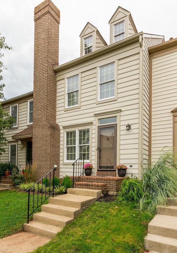
Our home was built in 1991 and has all the charm of a typical 90’s home (wink, wink). No but really, the exterior of the home drew me in with its brick front steps and its dormer windows. I wanted a traditional home, a colonial. I’m a huge fan of Williamsburg and its architecture and I wanted something reminiscent of that.

We made our offer and had our home inspection which at the time came back clean minus a couple of small items we thought we could address ourselves. To the naked eye and the home inspector, everything appeared to be working properly, and everything looked very clean.

However, after living in the home for a few months we started to notice that maybe things weren’t as clean and proper as we’d originally thought.

There were some simple issues of things being outdated, normal fixes that come with buying a home.

The washer and dryer were original to the home, yup, a circa 1991 washer and dryer set. We replaced those. We had squirrels living in our roof line, we removed those. We quickly learned that the dishwasher was running, but it wasn’t spraying water anywhere near our top dishes, so we replaced that. We learned the bathroom fans were running but none of them were removing any steam or moisture from the bathrooms. So we decided those should also be replaced. And that’s where our fixing up came to a screeching halt.


The Bathroom…

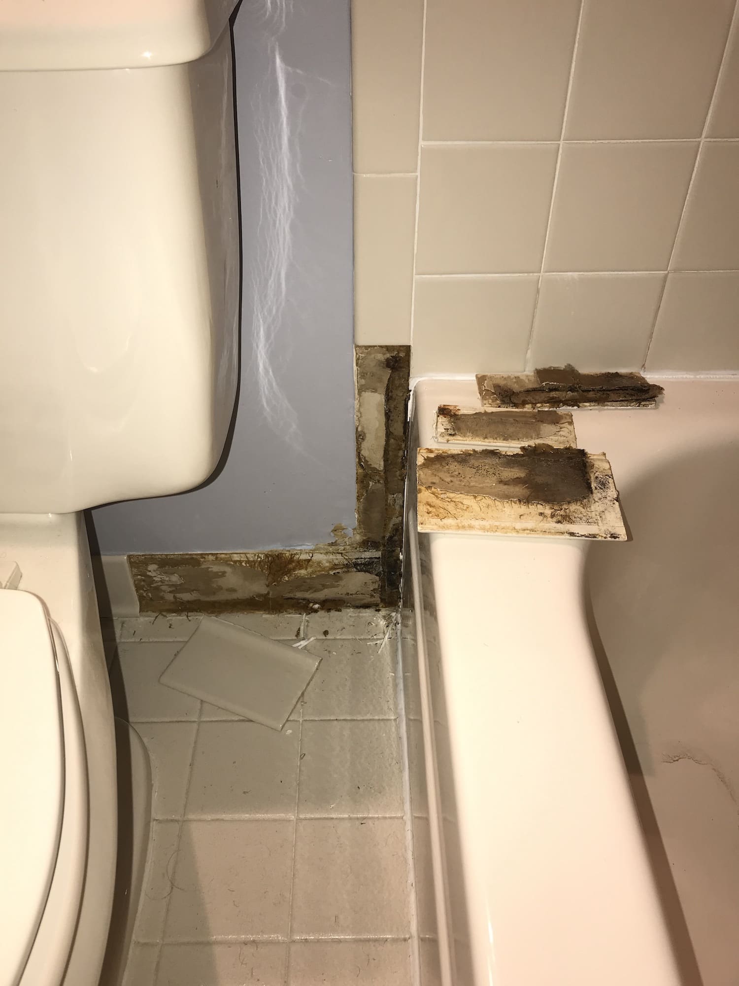
One fateful day I entered the bathroom and found.. a mushroom. I was MORTIFIED. We decided to have my Dad (John Murphy) come out and inspect the situation. He (rather easily) removed several tiles and we discovered two things. The bathroom hadn’t been waterproofed before it was tiled. Believe it or not, waterproofing isn’t mandatory in the state of Virginia. And a very intricate eco system was living between the tiles and walls of our shower. My dad left that day and Jon and I knew we needed to decide what to do, as soon as possible.


Warning: The following images may be disturbing to some viewers (like me). 

About 24 hours later we walked back into the bathroom and were overcome by the damp mildew smell in the space. We had only removed about 4 tiles at this point and the smell could knock you on your behind it was so strong.

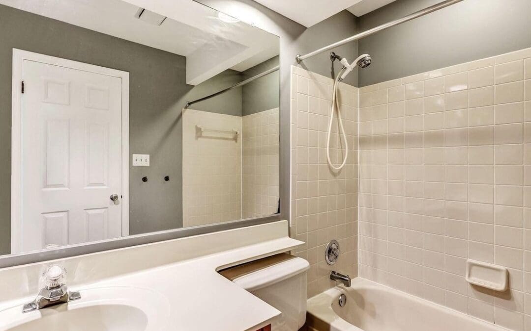
We could’ve treated the mold that we could see, seal up the drywall, waterproof and retile the shower but I’m not a fan of doing half a project. And to be honest that banjo countertop was just as unappealing to me as the mushroom was. So in the end we decided that ultimately the right choice for our health was to gut the bathroom and get down to the sub floor of the situation.

The bathroom was gutted that same week and we found mold on the sub floor, around the tub and toilet, and mold along the drywall near the tub. Thankfully the mold hadn’t penetrated the subfloor or the drywall so we treated and killed it and sealed the sub floor. Within just a few hours the space smelled SO much better.


Up Next…

I promise there will be no more mold and mushroom photos! I’ll talk about the waterproofing process that we always do at Murphy’s Design. And I’ll also be sharing the selections I made for the space and why I made them. I am a stickler for staying true to the style of the home but I do have a partner that prefers more modern touches. In order to make him and myself happy I decided to take a transitional approach to the design, but let’s be real… anything without mushrooms would’ve made us both ecstatic!

Until next time,

Lauren Murphy